

Form field label alignment has evolved over time. It’s been five years since I first introduced infield top-aligned labels. Due to its advantages over both top-aligned and infield labels, many have adopted them. However, it seems many have also adopted its counterpart, floating labels.
This is unfortunate for users because infield top-aligned labels have far better usability and accessibility than floating labels. The standard for label alignment should have a high level of usability and accessibility, or it’s not the best practice everyone should follow.
In this article, I’ll break down why and how infield top-aligned labels are more usable and accessible than its counterpart based on key form criteria. If you’re using floating labels, here are the reasons you should reconsider.
Active Field State
Floating Labels: Animation Woes
First, there’s the animation issue on floating labels. When users select a text field, the label transitions from a placeholder position to a top-aligned one with the animation. While this effect for the active state might look cool, it poses a problem for users with motion sensitivity.

Users with vestibular disorders need control over movement triggered by interactions. Non-essential animations can cause vestibular disorder reactions, such as distraction, dizziness, headaches and nausea (source).
If the floating animation only occurs on a few fields (short forms), it shouldn’t pose a problem. But when it occurs on many fields consecutively (long forms), the effects can compound and trigger unpleasant reactions on motion-sensitive users.
For non-disabled users, it poses a distraction problem during their task. It’s hard to predict whether the label will float or not float when they first encounter a field. When it does float, some users may be taken aback by the behavior. They may even play around with it, which takes time away from completing their task.
IFTA Labels: Simple Highlight
With infield top aligned labels, there are no unpredictable animations that surprise users. What you see is what you get. This static approach may not be as fancy, but fanciness isn’t needed as it adds little to no benefit for users.
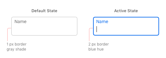
Instead of using an animation to indicate the active state, it highlights the label and border with a color hue. The border also increases from 1 to 2 pixels for greater contrast. Any extra features would only distract users from filling out the form.
Label Readability
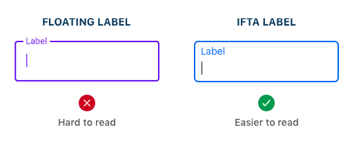
Floating Labels: Tiny Text Labels
When floating labels transition from the placeholder to top-aligned position, the text label typically shrinks and becomes tiny. This is standard behavior for floating labels because the label isn’t treated with importance after active field selection. The tiny label size makes the text hard to read when users need to check or correct their input. Low vision users will struggle the most to read the tiny text labels.
IFTA Labels: Readable from Start to Finish
Infield top-aligned labels don’t shrink on field activation. They stay at the same readable size as it started with. The label is treated with importance before and after active field selection. By not manipulating the text size, the readability remains consistent and there aren’t any sudden surprises to confuse users.
Recognizing Incomplete Fields

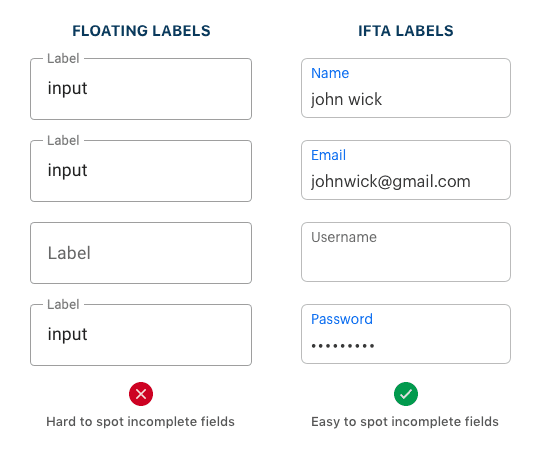
Floating labels: Placeholder Conflict
Floating labels start in the placeholder position of the field, which is the same place the user’s input goes. This placeholder conflict can cause users to mistake incomplete fields as complete because the fields are filled-in in both cases. It’s likely they could submit the form thinking every field is filled out and receive unexpected errors. Not only that, but any fields they skip or miss are hard to spot when they go back through the form.
IFTA labels: Filled-In States
There are no placeholder conflicts with infield top-aligned labels. The highlighted label displayed in the active state doubles as a filled-in state for recognizing incomplete fields faster. It does this by remaining highlighted after the user enters their input and leaves the field. If users need to find any fields they skipped or missed, all they have to do is scan the form for fields that don’t have a highlighted label.
Placeholder Hints
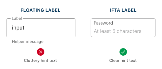
Floating Labels: No Room for Hints
An informative hint can help users out when they’re unsure of the proper input. Floating labels don’t leave much room for hints because the label occupies the placeholder space. Instead, the hint text has to go outside the field, which users can easily overlook. Not only that, but multiple hints would clutter up the form. The extra text would clash with the label and input text and make it harder for users to focus.
IFTA Labels: Room for Hints
Any fields that need hints have placeholder space on infield top-aligned labels. The hints are placed in a position where users can easily see them. They can read the label with the hint at the same time for faster processing. The hint text also won’t clash with the input text since it goes away after the user types in the field.
Distinguishing Input from Label

Floating Labels: Crammed Spacing for Two
Floating labels often make it hard to distinguish the input from label due to the lack of margin space separating them. The label and input are crammed so close that they tend to run together. Instead of reading it as two distinct lines of text, users see it as a blob of text.
The reason this happens is because the initial label and input are given prime spacing and vertically centered inside the field. As the label floats to the top on field selection, it becomes an afterthought and doesn’t get the spacing it needs. Not much attention is given to how the label would look when it floats.
IFTA Labels: Fitted Spacing for Two
Instead of cramming the label with the input, infield top-aligned labels require you to give equal attention to both texts from the start. When you design, you have to think about how the label and input will look together. This causes you to make sufficient room to fit both of them instead of one over the other. With fitted spacing, it’s easier to distinguish the input from label when users check over the form.
Infield Top-Aligned Labels Win

Infield top-aligned labels succeed in areas where floating labels fail. They may seem similar, but there are key differences that set them apart. Once you understand them, you’ll know why you should adopt infield top-aligned labels over floating labels.
There’s one reason you may want to use floating labels, though. Floating labels are fancy and fashionable due to its animation and Material Design’s adoption of them. So, when you’re designing a form, you got to ask yourself a question. Which is more important: a usable form or a trendy one? Trends tend to fade over time, but a true standard lasts a lifetime.