
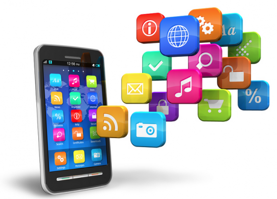
There’s nothing novel about using icons within mobile apps. From the home screen icon to the navigation menu, they’re pretty much a standard part of the apps that designers build.
They come with big benefits too:
- Minimized distractions,
- More attractive UIs,
- Empowerment of users to easily engage with the app,
- Elimination of language barriers,
- Improvement of brand recognizability.
But are we using icons as best as we can or are there ways to improve the mobile UX even further with iconography? Today, I want to look at a number of ways you can creatively add icons or icon-like elements to your apps and bring more life (and engagement) to them in the process.
Making The Most Out Of Icons
Icons are super useful design elements for mobile interfaces. While we do have to be careful with icons (like making sure navigational icons are always paired with text as well as not using so many that the interface becomes like a puzzle to be solved), there are some additional use cases I want you to consider:
1. SHOW HINTS OF BRANDED ICONS THROUGHOUT THE APP
Users will first get a glimpse of an app’s branded logo icon from the app store. Once installed, this icon will become a persistent presence on the user’s smart device, which will foster greater awareness of the app.
What I’ve noticed with many apps, though, is that the brand icon doesn’t often appear past that point. In some cases, it makes total sense. An app isn’t like a website that needs that steady logo anchor so users can always quickly get “Home”. But…
I can’t help but feel like small branded elements throughout could add a unique touch to the experience. They wouldn’t detract from the experience. Instead, they’d show up in bite-sized chunks that add something extra to the experience.
One example I really like is the CheapOair app. This is the logo that appears when a user first opens it. It’s the same one that appears at the top of the corresponding website:
Now, if you were to look at the app store page for CheapOair or how it appears on a user’s home screen, you’d see that the full logo isn’t used. Instead, users see the luggage-shaped “O” icon:
It’s unique. It’s memorable. And it works well in tiny spaces, like as the desktop favicon or on smaller mobile screens.
Now, for an app like CheapOair that aggregates travel listings from different airlines, hotels, car rental agencies and so on, it’s only natural to expect some lag time as users move through the app. And while the designers could’ve used a more traditional loading icon (like the spinning wheel or progress bar), it uses its branded icon instead:
As users move between screens or search for travel reservations, the “O” icon keeps them company. It’s such a small thing, but I think it adds something extra to this experience which makes it more memorable for users.
Another example I’m fond of is what Hotels.com does for its reward members.
The Hotels.com “H” icon isn’t really present when a user is inside the app, with the exception of its loading screens (it does the same thing CheapOair does). And that’s fine. It definitely helps to create a more distraction-free interface when needed while also saving that header area for more useful information, like breadcrumbs.
That said, Hotels.com does include another one of its branded icons in the app, only it’s reserved for rewards members.
This is the “Rewards” tab where users track how many stamps they’ve earned towards a free night:
The stamps are in the shape of a moon. It’s not officially part of Hotels.com’s branding, but it’s a very recognizable icon for its rewards members.
Because of this recognizability, its placement within hotel search results pages is helpful as it allows users to quickly scroll through and see which hotels they can earn another stamp with:
There are many different factors that users consider when booking a hotel room, including price, distance, average user rating and so on. But rather than bog down the main listing with this extra detail that’s only relevant to rewards members, the use of the icon and its placement in the bottom-left corner of the image for eligible hotels is a good choice.
So, even if you don’t feel like using the actual brand logo within the app (or find no reason to), this example proves that there are other ways to use brand-adjacent iconography to improve the experience.
2. USE ICONS TO ENCOURAGE MORE GESTURES AND ACTIONS
One of the keys to retaining more app users is to give them a reason to regularly engage with it. And if your users can’t remember which gestures to use when they’re inside the app or they find the act of interacting with it to be boring, that may be enough reason for them to go looking for apps that do a better job of capturing their attention.
Even if your users don’t have any problem with how the engaging elements are presented to them, what happens if someone they know suggests an app that they like better? And they see how much more they like the presentation of different elements?
Either way, you don’t want to give them a reason to lose interest or look for greener pastures. And I think that icons added to gestures and clickable targets can help with this.
This, for instance, is the Boomerang for Gmail app:
I needed a way to “pause” my Gmail inbox during the workday (to prevent distractions) as well as in my off hours (to keep myself from working). While there are a number of distraction-blocking tools available, I loved the simplicity and elegance of this one. I especially appreciated this sorting gesture.
There’s no need to open the message and use the options bar to select the right option. When messages appear in my inbox, it takes no more than a second to swipe left and take action because of how clearly labeled they are. And because I use this app every day, my finger automatically knows which icon to flick the message to: archive, mark as read, Boomerang (for another day/time), move or delete.
Again, if you can make engaging with an app go more smoothly — which, in this case, I attribute to the complex gesture simplified by recognizable icons — you’ll find users are more likely to use it.
Your app doesn’t need to have swiping gestures in order to play around with engaging icon design. Duolingo, for example, has brought its language modules to life thanks to these animated icons:
When a user clicks on a new module, the details of the module and the “Start” button aren’t the only thing they see. The icon they touch will come to life for just a second, like the man running or the bucket filling with paint.
In this case, I think the animated icon makes the upcoming lesson feel less intimidating. It sets the tone that, when you click this button, you’re about to enter an enjoyable experience.
3. BRING PROGRESS INDICATORS TO LIFE WITH ICONS
When asking users to complete tasks inside your app, you want them to feel motivated to work their way through each step or stage.
But we’ve seen this time and time again with forms that seem like they take unreasonably long to complete or ask for too much from users. If you push the limits of your users without being transparent about what’s involved or how long it will take, they’ll give up on the experience entirely.
So, when you have activities like these in your app that you expect some users might find burdensome or boring or unsurmountable, show them a progress indicator to help them along. What I’d like to suggest is that you take it a step further and add an animated icon to it.
You’ll find a fun example of this in the Plants vs. Zombies game:
Players aren’t just focused on laying down plants to fight against zombies and defend their home. They’d be smart to watch the progress indicator at the top, too. As new waves of zombies reach their lawn, the zombie head moves further and further along.
It’s not so much a big deal in the earlier levels of the game, but it’s useful to have that zombie head up top to always remind them of what’s to come when they’re feeling overwhelmed and wondering how much more they have to deal with.
Animated progress icons aren’t just useful for games though. Take mental health app Sanvello, for instance:
Users of the app set their own mental and physical health goals in this tab. Each day, they’re tasked with going in and marking their progress on each of them. If they can get them all to green, they’ll see the heart icon at the top not just fill up with green color but glow.
It’s a small change to the UI, but it’s definitely one that I think would encourage your users to log in and actually do more with your app.
4. TURN NON-ICON ELEMENTS INTO ICONS
When we use iconography in apps, we almost immediately think about the standard icons we see from app to app. The hamburger menu. The settings gear. The search magnifying glass. Even icons like the ones we’ve seen above are to be expected.
While I recognize that we don’t want to overdo it with icons since they can easily clutter a space, what about apps that are overloaded with content? Our users’ eyes and brains can only take so much before they give up on reading and start scanning through the page.
This is where I think non-icon elements being turned into icons could really help. Think of them as visual breaks amidst all that content. It’s no different than what we’d do to format a page on a website, giving visitors something attractive to look at before jumping back into reading. In the case of mobile apps, I think it can also improve comprehension of what’s before them.
Let’s look at a few examples, starting with BuzzFeed:
Have you ever read something online that was so good (or maybe even so bad) that you had to know who wrote it? For the most part, online publications just put a byline at the top and a short bio under the post. BuzzFeed, however, gives its author more than just name recognition. It pairs their byline with an iconized headshot.
This is a great touch. It tells readers from the get-go that they have real writers behind this piece and lets them connect to the writer on a more personal level.
It’s also just too easy for this detail to get lost on a page because of the title, subtitle, read-minutes and other metadata that publications put at the top. I’d say in terms of making an article more attractive and welcoming, even this small of an icon helps set the stage for an enjoyable reading experience.
Food service apps could probably benefit from this as well. Only, in this case, it would be food items and products that become iconized. Like what the SONIC Drive-in app does:
There was a study done by Durham University on the connection between images and satisfaction with a food order. The study looked at a number of variables, but this one is particularly relevant to what we’re looking at in the SONIC app:
“Our research revealed that if a restaurant wants to make use of imagery and visual prompts on their menu, this needs to be combined with commonly used and ‘accurate’ food names to increase marketing power. While it may seem a basic approach, photos can act as a positive reinforcement for customers who have made a visual connection that reflects the name of that dish.”
This is exactly what SONIC does in the above example. Rather than show one of their cups filled with the soft drink or show no photo at all, it displays the brand logos as icons beside each.
These brands are so deeply ingrained in the consumer consciousness that it will make the ordering process go much easier. It should also lead to greater satisfaction overall as there’s no surprise about what they’re getting.
Then, there’s the use case for marketplaces, like Rakuten:
This ebates app helps users make money off of their online purchases.
Now imagine if this app were just a text-only list of deals. Sure, it would still be usable and useful… but users would likely resort to the search bar to find deals as opposed to actually reading through what’s available. And if your users can only find what they want through search, there’s something wrong — especially if you’re presenting them with the hottest offers or products of the day.
I looked around and couldn’t find any ecommerce marketplace that does something like this — pairing a product or deal with a brand icon — which I find surprising. While I realize users can sort through listings by brand name, wouldn’t an iconized brand logo help users more easily locate items they want to buy from search results?
I guess the big argument against this would be for marketplaces pushing their own products (like Amazon does). By displaying a brand icon either in search results or on a product’s page, it might deter users from buying the item if it’s from a lesser-known and unrecognizable brand.
For concepts like Rakuten, however, it totally works and I’d urge you to use it when you can.
Wrapping Up
As you can tell by these examples, you’re not going to completely revamp the look and feel of your mobile app with icons. Instead, by adding very subtle touches here and there — that users are bound to take notice of — you’ll impress them with your attention to detail while making the overall experience more enjoyable. This, in turn, can lead to greater levels of engagement and higher rates of user retention.
